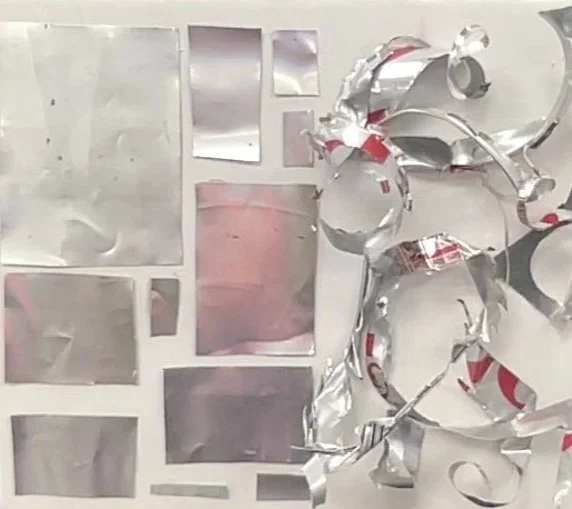
Contrast of Diet Coke
My Contrast Sculpture
In this sculpture, my goal was to show contrast in terms of order versus creativity. On the left side, I made neat 2D rectangular shapes. They were all very similar, separate, and plain with a smooth and finished texture. I was inspired by the homogeneous buildings in an urban city layout, with large smooth, glass, and metal buildings. On the right side, I created one, unified form. I purposefully made it very jagged and sharp, wild and untamed to display the chaos that is part of creativity. I also made this side have more height, showing that creativity is not bound by an expected format and structure. This also represents the logical left brain when compared to the more creative and intuitive right brain. One thing I think I did well was create a very chaotic and wild right side. I like how everything kind of branched off of each other and I think it works well. One thing I think I could do differently is maybe create 3D cubic buildings on the left. It was my idea that the height would contribute to the contrast, but this would also have been an interesting and more challenging route to take.
Definition: the deliberate use of opposing or different visual elements—like color, size, shape, or texture—to create visual interest, hierarchy, focus, and impact, making elements stand out and guiding the user's eye through the composition

